Evaluate and Iterate
Gonzos Tearoom
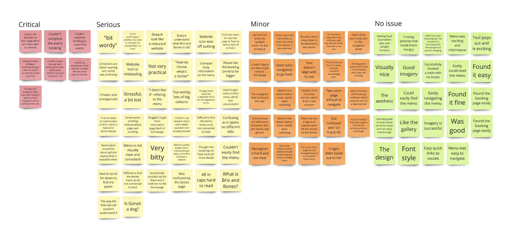
Affinity map from user interviews
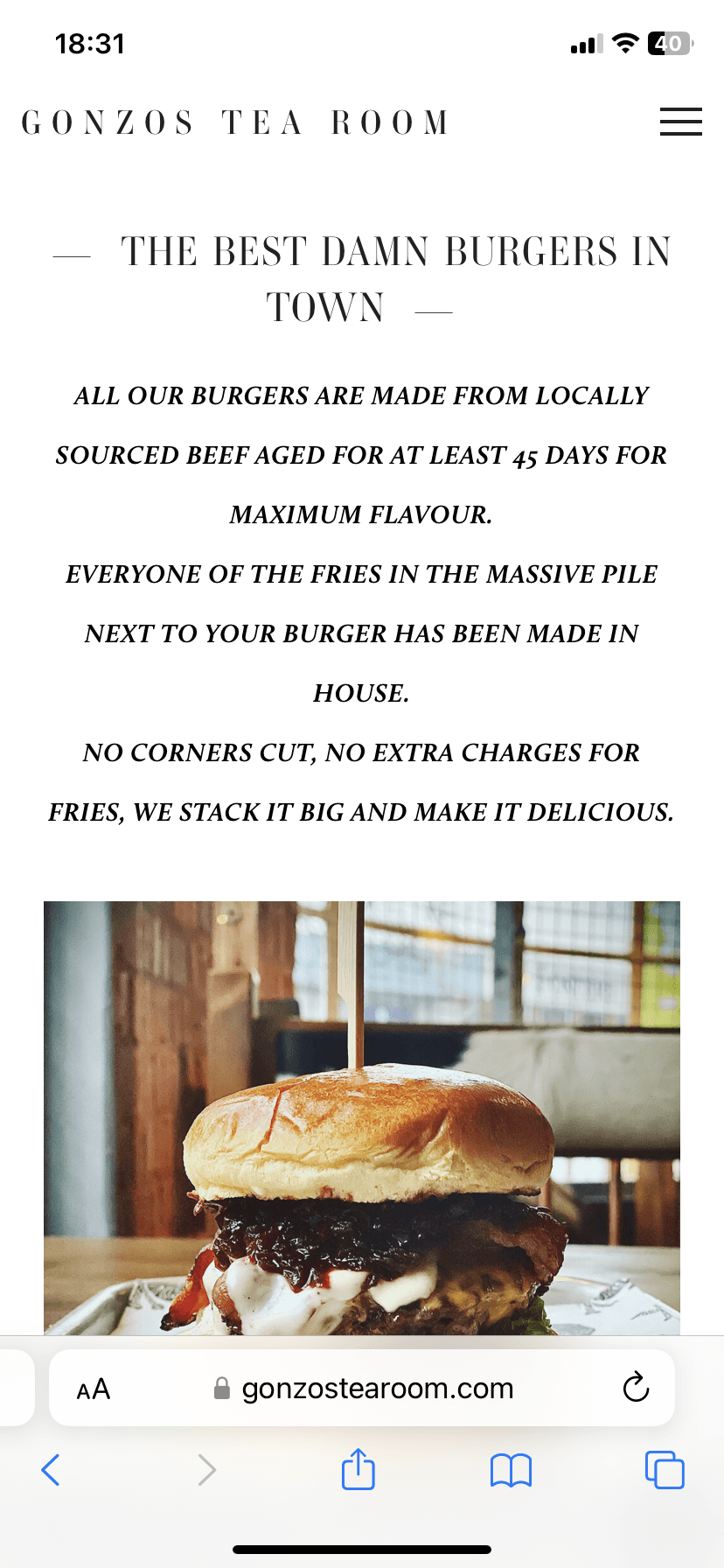
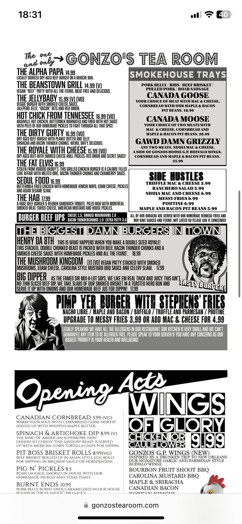
Original Gonzos Tearoom Website
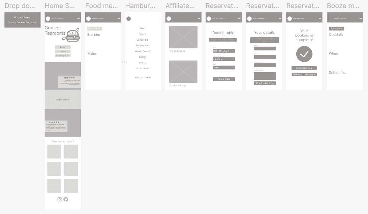
Wireframe design
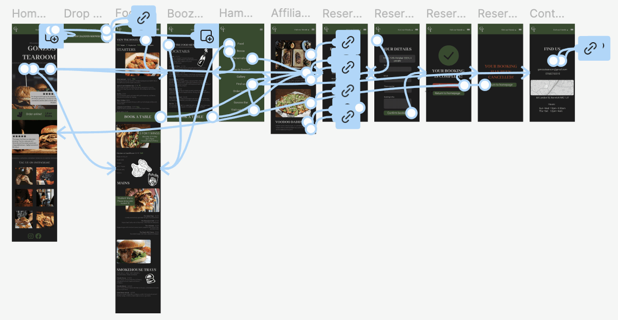
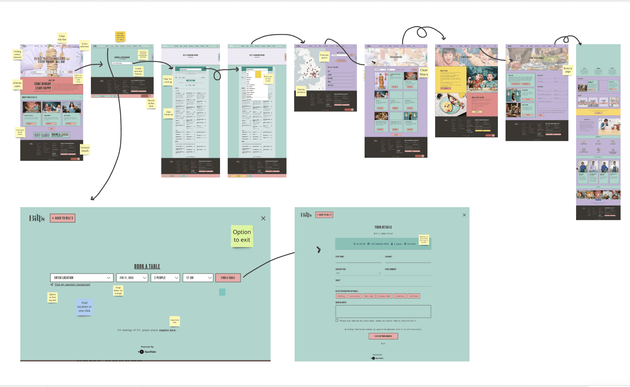
Prototype of high fidelity design
High fidelity prototype

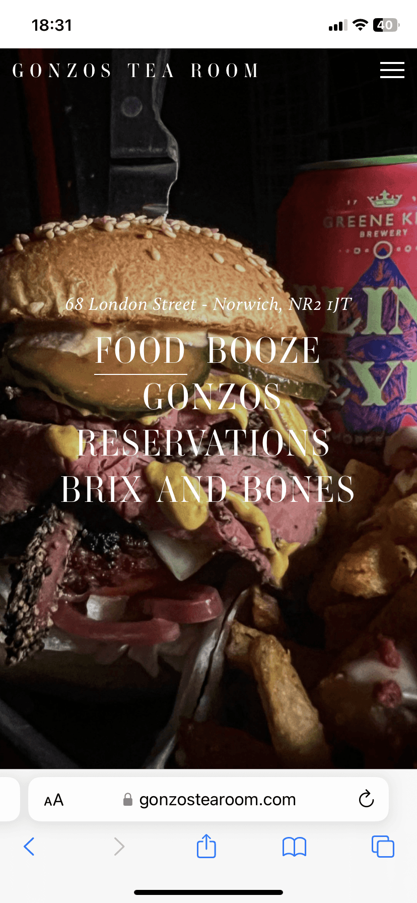

Before
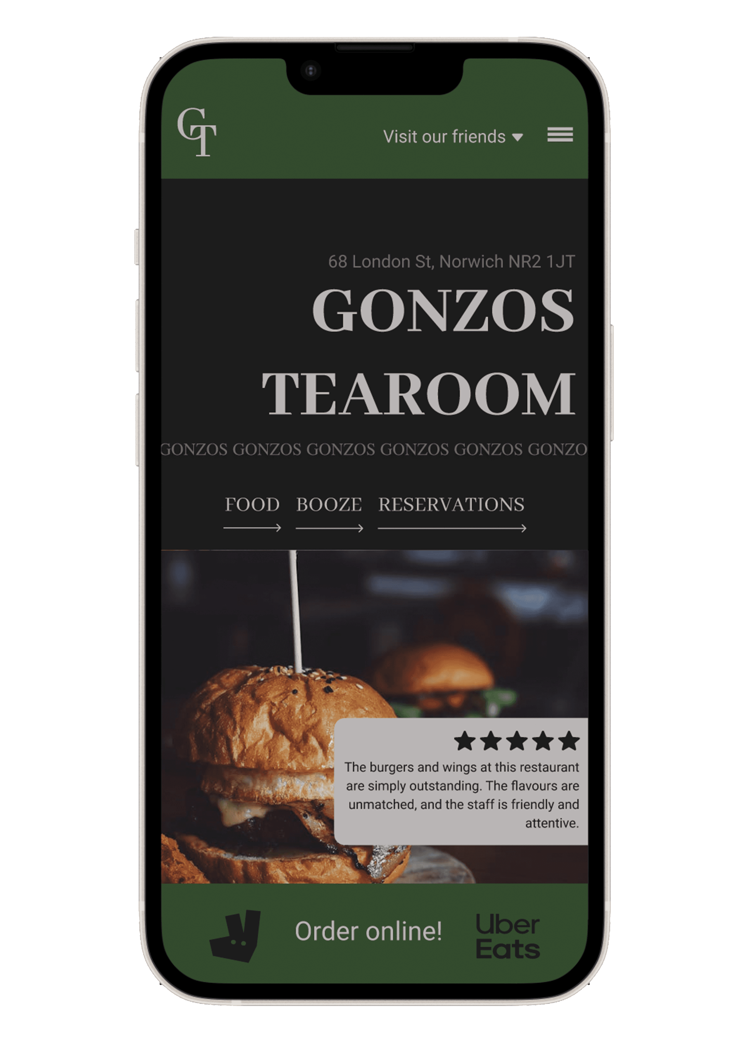
After
Competitor and Brand Research
User Testing
Problem
After user testing, I was able to group issues into crucial, serious, minor, or no issues. I carried out the user tests on a mix of mobile and desktop to get a variety, as when looking at menus online, people tend to use either their phone or laptop. The main theme that stood out to me was that navigation was difficult as it was not clear what a button was.
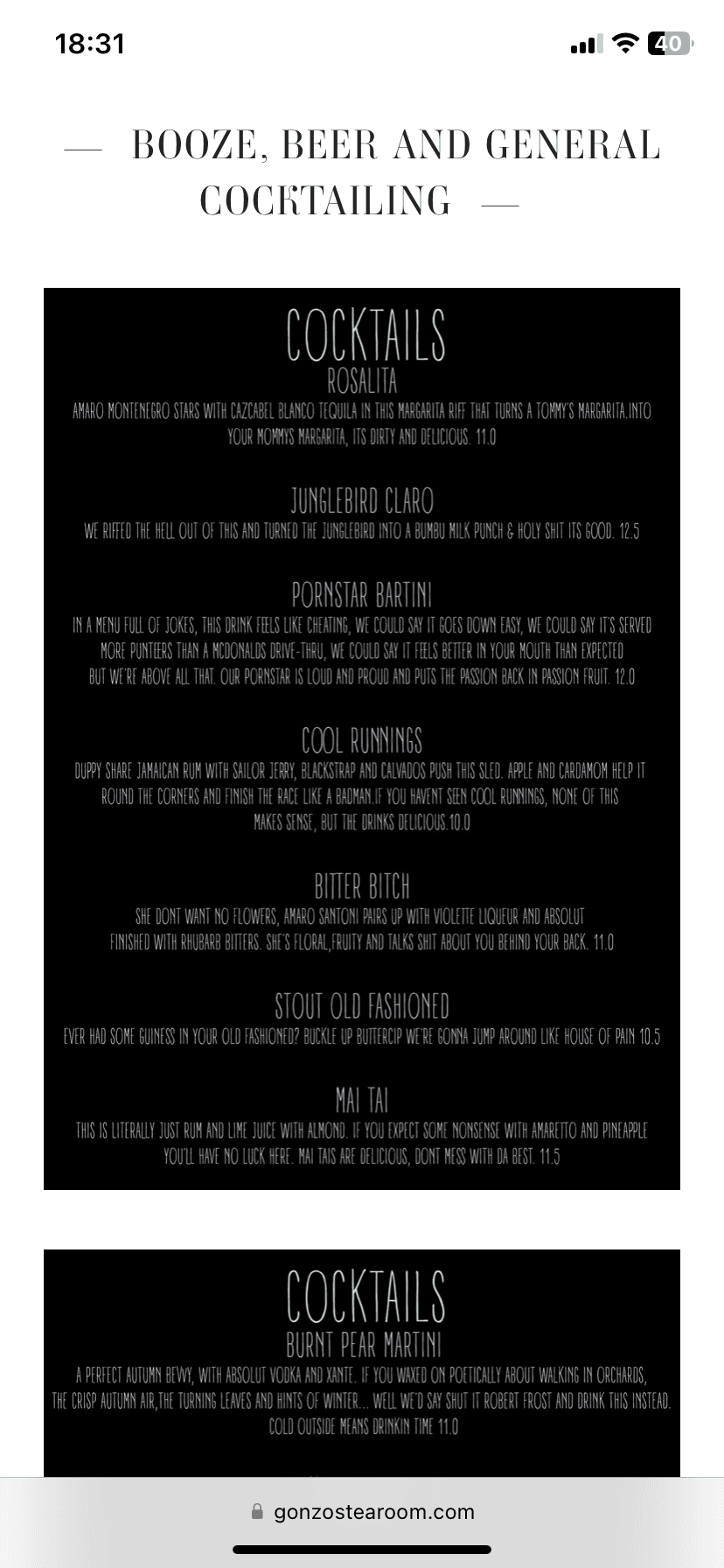
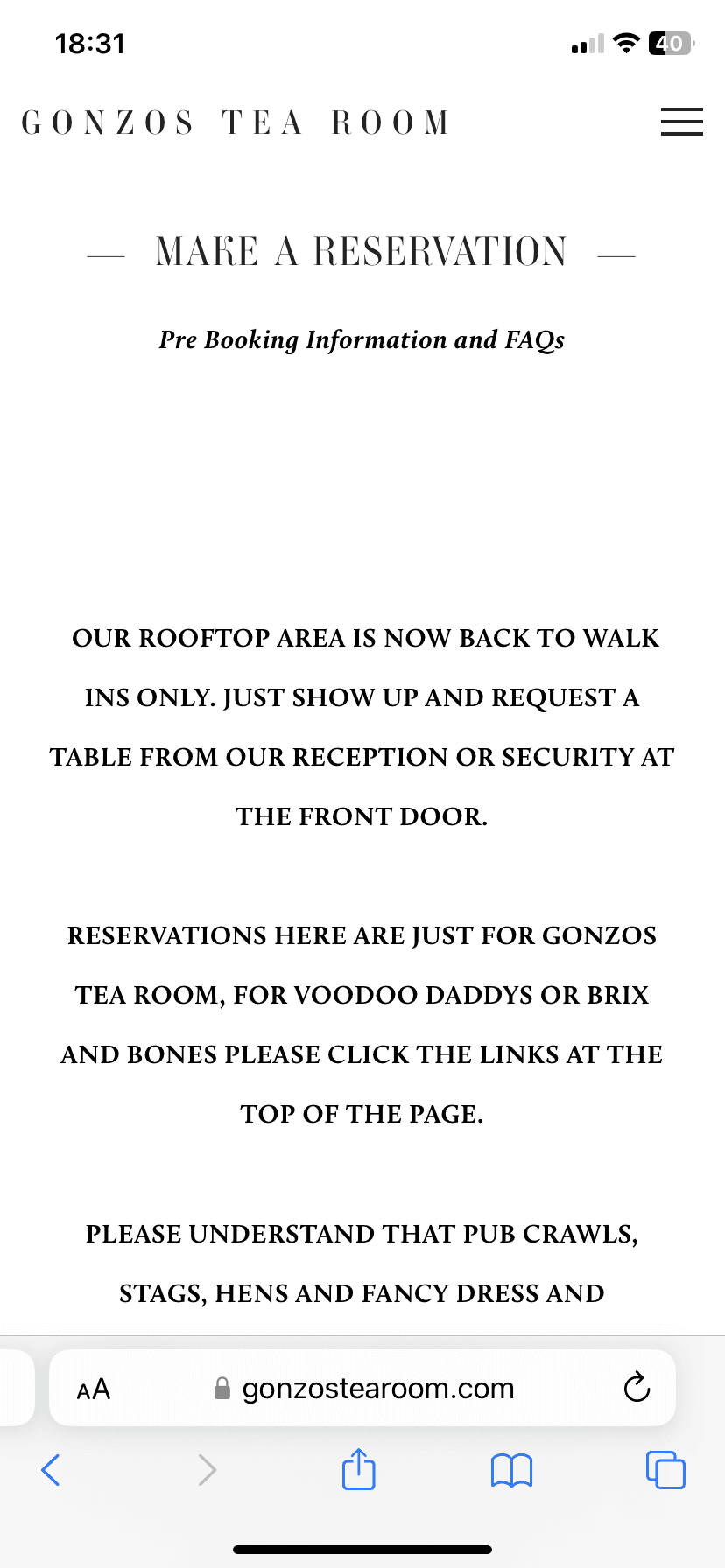
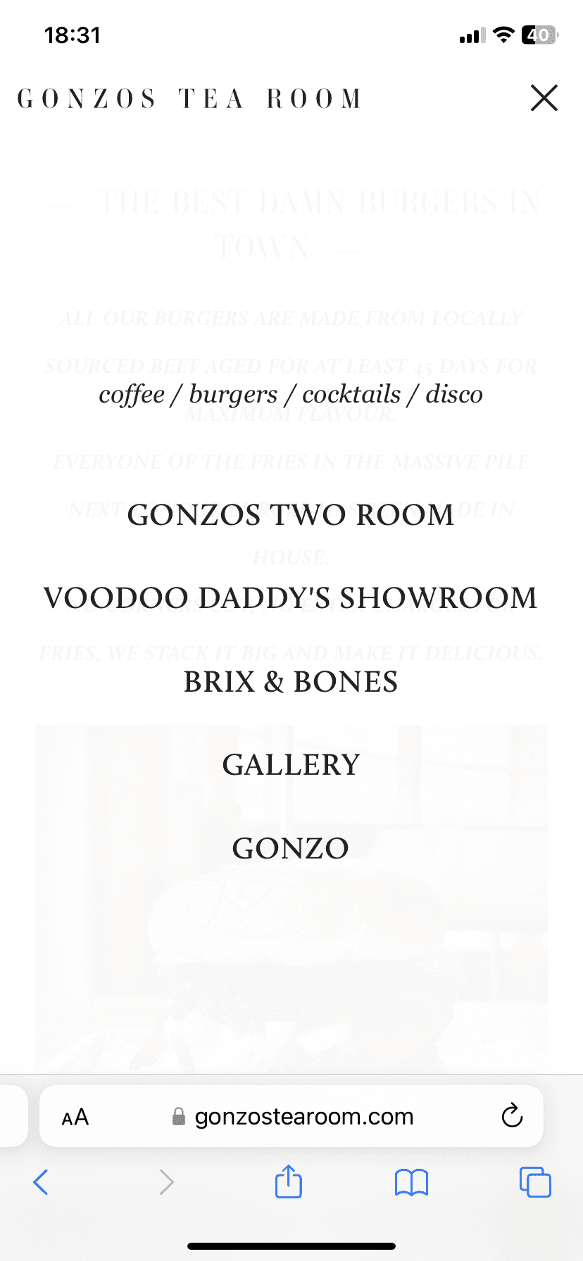
Another main issue was that some buttons would take you to a separate tab or website completely without being clear beforehand, and often, there wasn't a back button. Furthermore, most of the text was written in big chunks and centred, resulting in a hard read.
Opportunity
Development

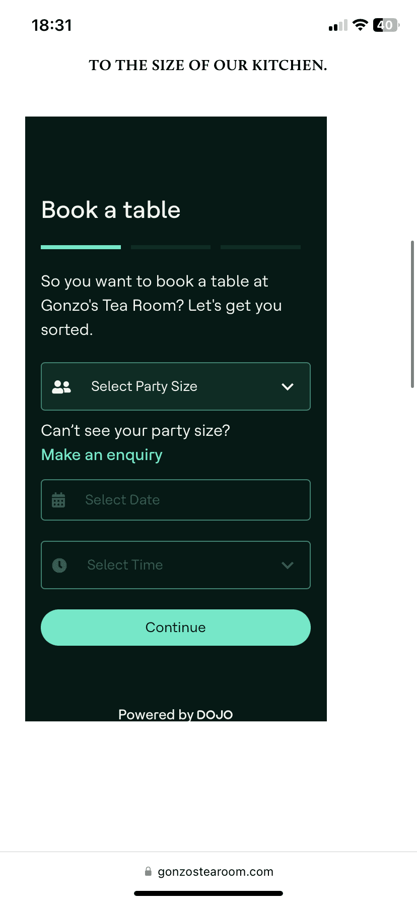
Gonzos has a strong image, including cinema references, dark, moody colours and funky typography. When looking at competitors, I looked at restaurants such as Bills, which are at a similar price range and do offer similar food. I was particularly interested in their booking system and how they got the user from point A to point B.
To prepare for user testing, I set some tasks for the users to complete to determine the opportunities for improvement. The tasks included:
Can you check what vegetarian options are on the menu for your friend?
You want to go out for lunch with one of your friends at 1:30. Are there any tables available?
you have a budget of £40 per person for a 3-course meal, including drinks, is this affordable?
You want to go out with 2 of your friends on Friday night for dinner and then one of the events later that night. Can you check the events that are on and then book tickets for the restaurant and event?
The Gonzo website had many features, breaking Jacob's 10 heuristic rules. This resulted in a website that was hard to navigate, confusing and disengaging. There was a sense of fun, but the quirkiness was quickly confused by disorganisation
Gonzos has a strong brand, one that is fun and exciting. Pairing this with a website that is engaging and easy for the user to use and navigate would result in a higher number of bookings.
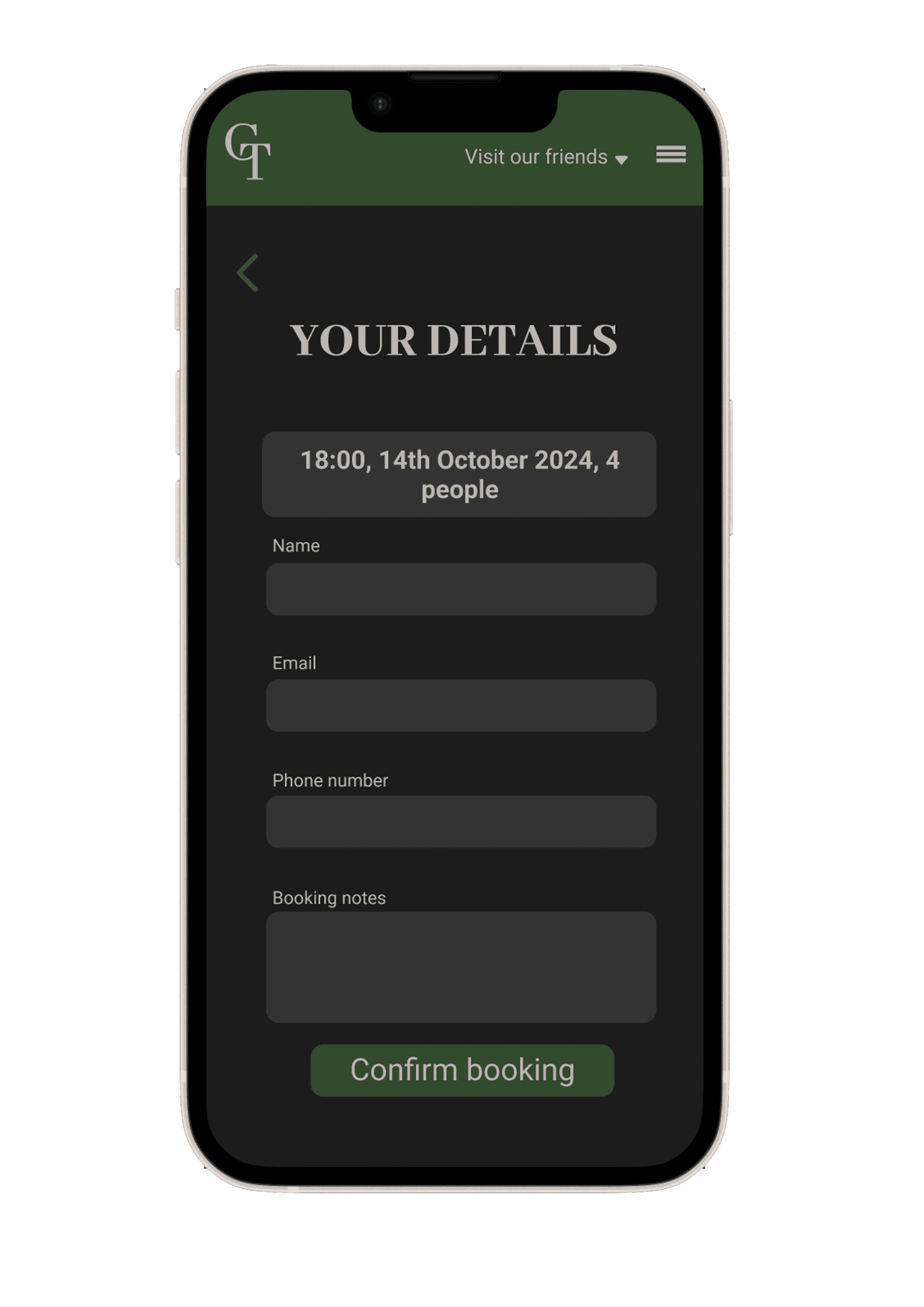
I began designing wireframes, mainly focused on stripping down the navigation and options to allow for a user-friendly design.
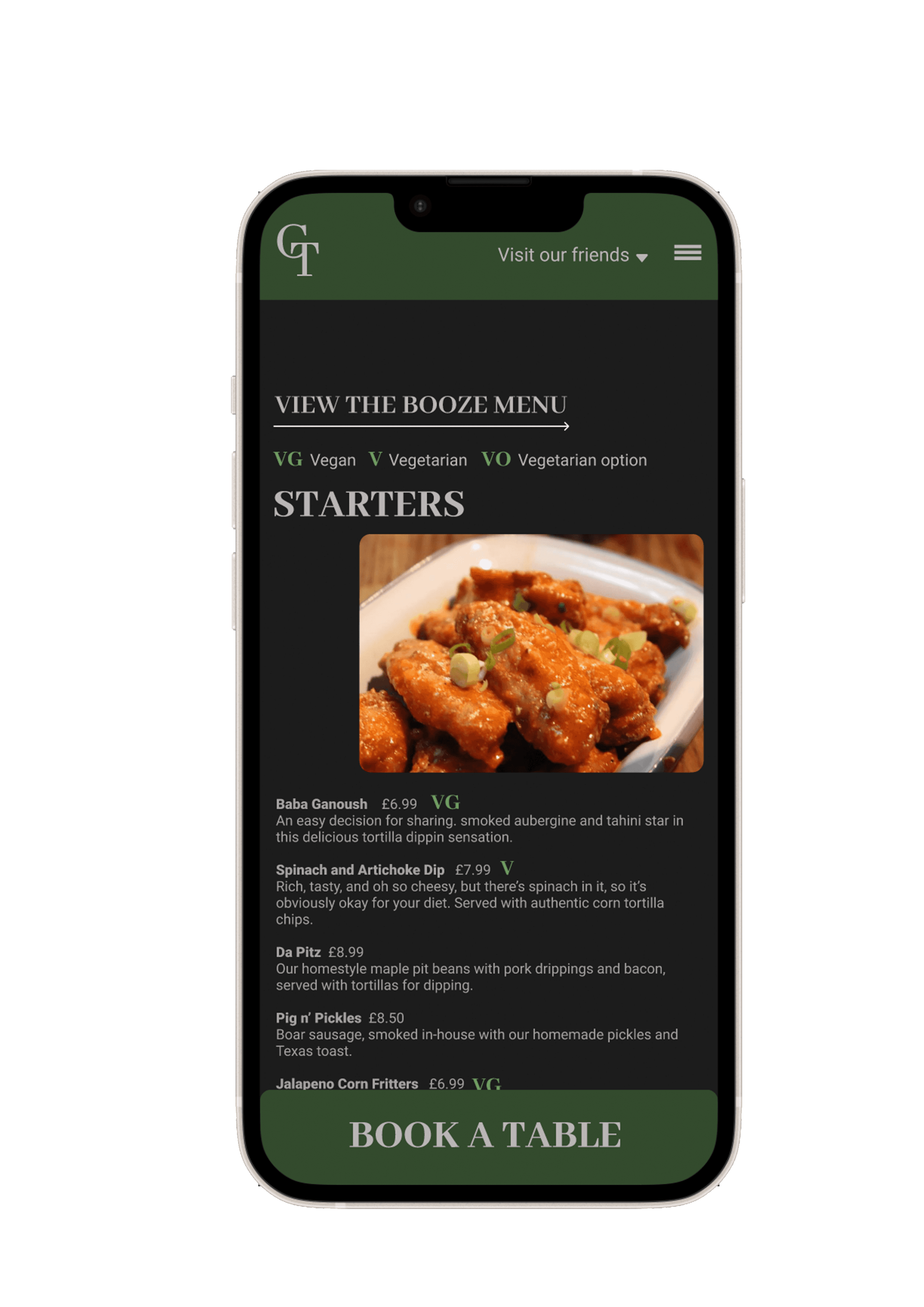
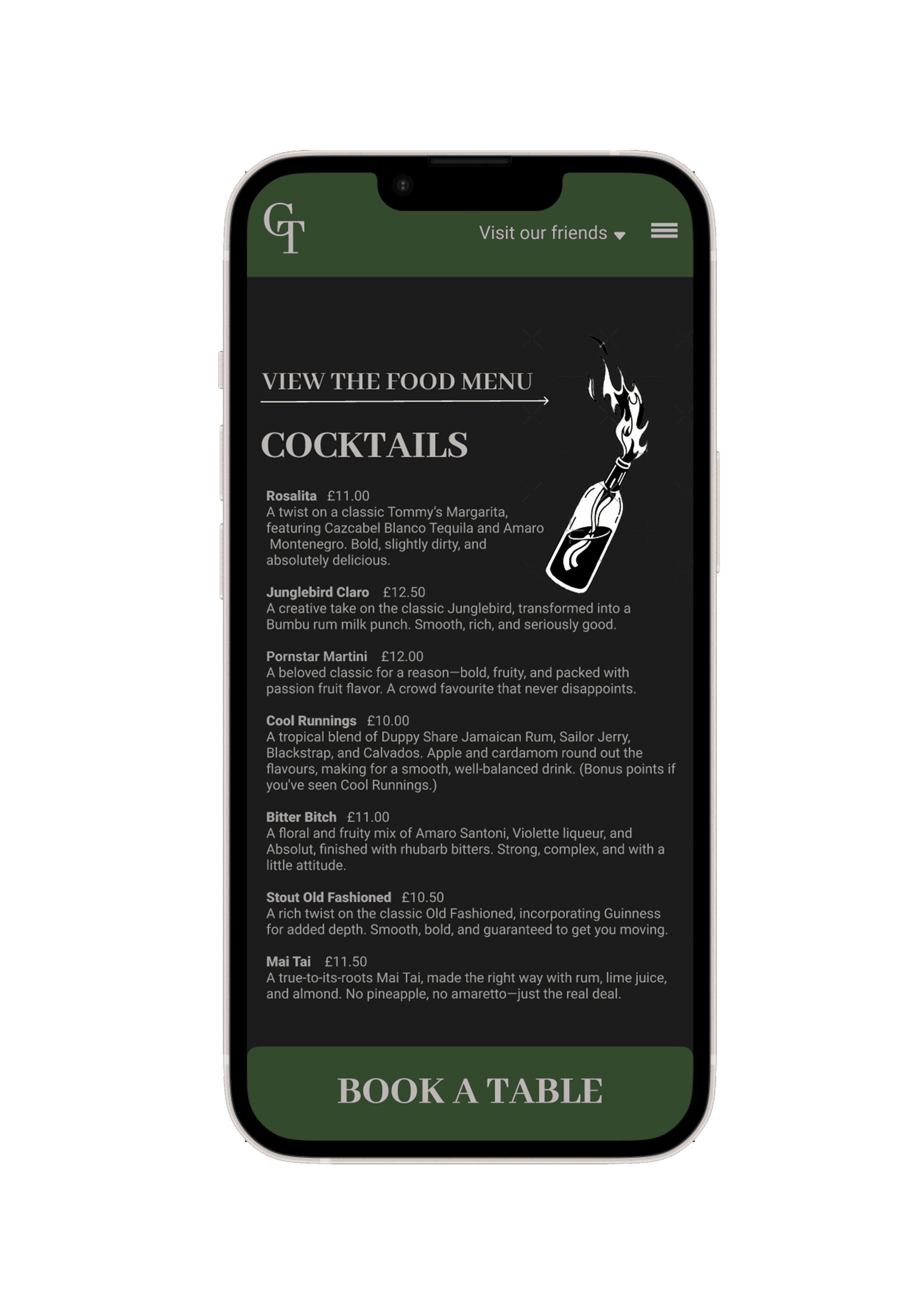
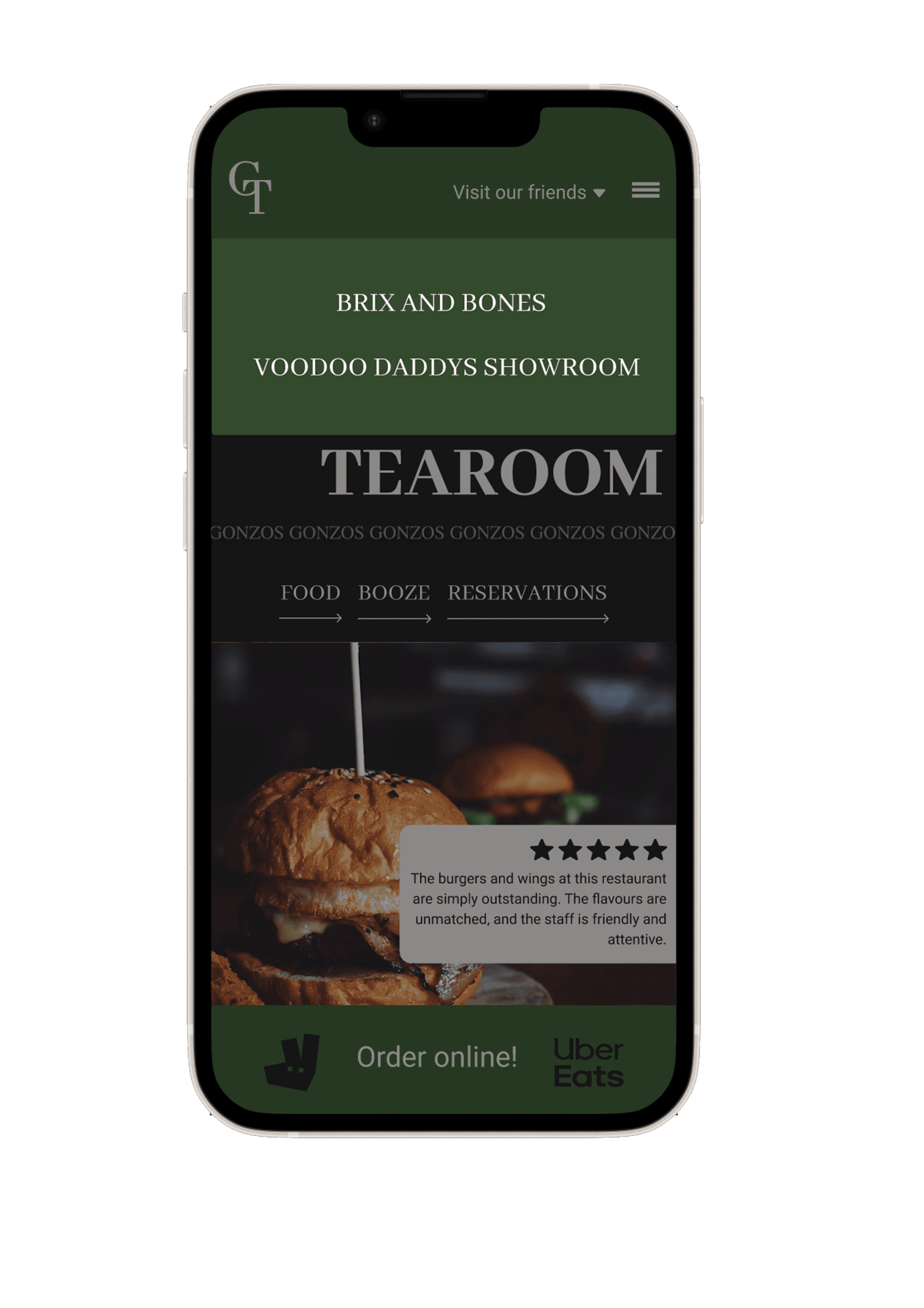
I wanted their engaging photos to be a main element of the design as they are likely to interest the users more in wanting to eat there.
In the High-fidelity version, I focused on the colour scheme and typography, wanting the brand image of the restaurant to come through the design. I wanted to carry through a similar serif font to emulate the classy, mature brand identity.
Summary
Overall, this project was a learning curve, and I kept returning to it to tweak and adjust various parts. In reflection, if I were able to start completely from scratch again, it would have a very different outcome, but I appreciate being able to look back and see how far I've come.